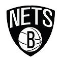
How Does the Nets' Logo Make You Feel?
Well, its hard to believe the day has finally arrived, but it did. We no longer need to walk around in a confused stupor wondering what the h— the Nets’ new logo is going to be. I don’t know about you, but my fingernails are just about chewed down to the cuticles, so the announcement came none too soon.
Yea, its black; I coulda told ya that. It says Nets on it. Duh. And it has a cute little kinetic basketball with a “Big Bad B” inside. That’s a surprise. I guess the ‘B’ stands for Brooklyn, or Basketball, or maybe BORING. Whatever. Glad to get that little bit of news out of the way, that’s for sure.
How do you feel about the new logo? Why don’t you drop us a line, and we will post the funniest, printable (no bad language or blame, please!) little essay under 300 words, and even give you credit. We retain the right to edit as we see fit.)
To help you decide how you feel about the new face of Brooklyn’s newest team, here’s what Jay-Z, part owner and part designer had to say about his creation:
“The Brooklyn Nets logos are another step we’ve made to usher the organization into a new era,” Jay-Z said in a statement. “The boldness of the designs demonstrates the confidence we have in our new direction. Along with our move to Brooklyn and a state-of-the-art arena, the new colors and logos are examples of our commitment to update and refine all aspects of the team.”
Did he say “colors?” Whatever.

Hiç yorum yok:
Yorum Gönder